Classification of ASTER images -an example for glaciated regions.
Step 1: Preparing data
A- Combining information
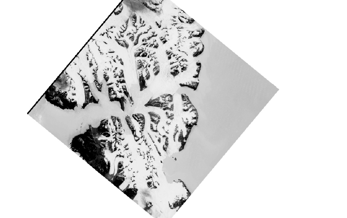
The aim of this spectral bands combination is to get a high contrast between glacier ice and rocks, water of any other feature in the image. Our source of information is an image derived from ASTER. It is compounded by several bands of information, each one representing one range of the electromagnetic spectrum. Therefore, we have different information storage and spread in different bands. In order to be able to work with different info (different bands)it is necessary to combine them. Band combination will use different algorithms depending on what is convenient to be highlighted. Most frequent ones are the division of two spectral bands (often called band ratio) (e.g. band 4/band 3) or index as Normalized Difference Snow Index (NDSI) which is based on differences in spectral properties of snow in VIS and MIR. This step can be implemented on PCI, under Modelling mode, and using ARI function. Also in ArcGIS with the tool raster calculator.
To implement raster operations with ArcGIS, it will be necessary to do it under floating number-types. The following figure shows the NDSI composion of the ASTER image.
B- Filtering
After band combination is convenient to pass a filter. Filtering will remove the noise and will make the image smoother. There are different types of filters, but for this case, I will recommend to use a low pass filter as median or average. After filtering, the image will be more consistent, and different features will have stronger frontiers. Also debris-patches can be removed. PCI Geomatica offers a wide variety of filters (FME,FAC,FGA…), although is also possible in ArcGIS.
Step 2- Detecting glaciers from its brightness value
I will go through two alternative methods to carry out this task. The first one is based on applying a threshold on ArcGIS and the second in based on the Automatic Classification algorithm implemented in PCI Geomatica (ArcGIS also offers this possibility).
A- Applying Thresholds (Reclassify)
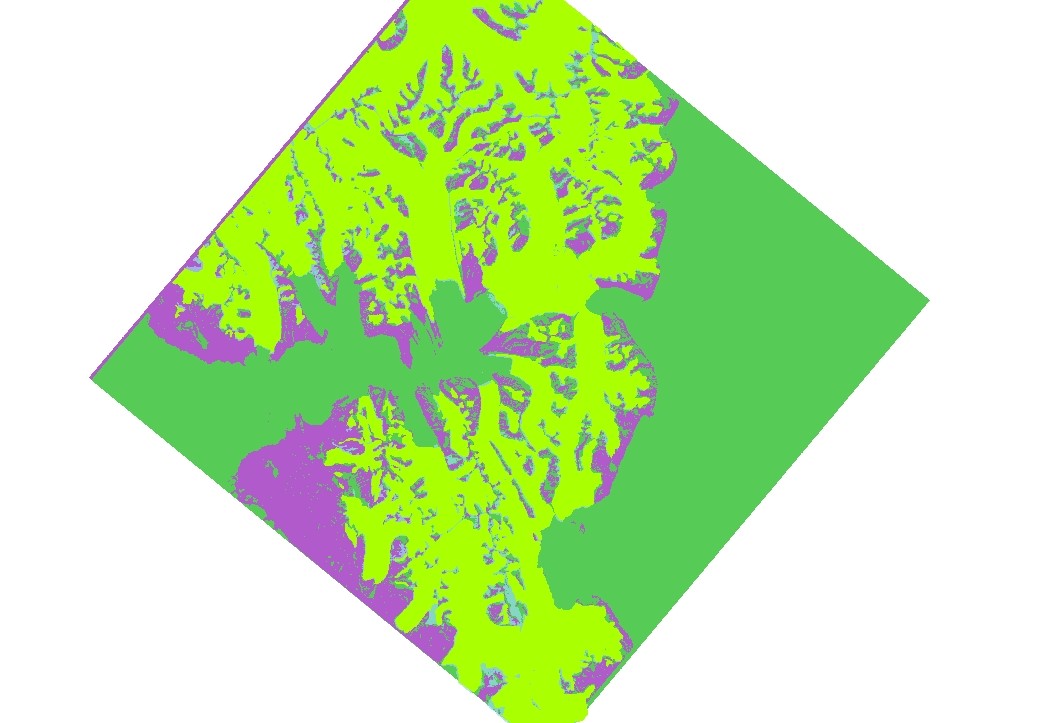
Every feature represented in the ASTER image has a representative range of brightness values. Allowing ice to be easily distinguished from the rock or from the water. Difficulties can arise in shadow-areas, clouds, ice with high impurity content and specially debris cover on glaciers. In such cases manual correction is necessary. From this step, the work will be developed in ArcGIS. It is really important choosing representative threshold value to separate ice from the other elements in the image. This value will depend on the spectral bands -or combination of them- we are working with. Once the threshold is established, using Reclassify function on ArcGIS you can give a distinctive value to all pixels whose brightness is within the range chosen. The rest of pixels will have a different value so they could be deleted. Converting the resulting raster into a polygon, you will obtain the mask for all the glaciated part of the image. You can repeat the same process to mask out Land and Water to classify the entire image. The following figure shows the classified image distinguishing between glacier ice (in yellow), land (in purple) and water (in green).
B- Automatic Classification in PCI
This is a semiautomatic process developed in PCI Geomatica which consists in providing the software information about the signatures of the different features present in the ASTER image. Then, the software is able to identify the areas with similar signatures (or pixel values). The output of automatic classification is similar to thresholding, but here is not necessary to find threshold values. For more information see this [link] (http://www.sc.chula.ac.th/courseware/2309507/Lecture/remote18.htm). With supervised classification, we identify examples of the information classes (i.e., land cover type) of interest in the image. These are called training sites. The image processing software system is then used to develop a statistical characterization of the reflectance for each information class. This stage is often called “signature analysis” and may involve developing a characterization as simple as the mean or the rage of reflectance on each bands, or as complex as detailed analyses of the mean, variances and covariance over all bands. Once a statistical characterization has been achieved for each information class, the image is then classified by examining the reflectance for each pixel and making a decision about which of the signatures it resembles most. Maximum likelihood Classification is a statistical decision criterion to assist in the classification of overlapping signatures; pixels are assigned to the class of highest probability. The maximum likelihood classifier is considered to give more accurate results than parallelepiped classification however it is much slower due to extra computations. We put the word “accurate” in quotes because this assumes that classes in the input data have a Gaussian distribution and that signatures were well selected; this is not always a safe assumption.
Accuracy Assessment
We carry out an assesssment to determine the accuracy of the supervised classification (or any other automatic classification) based on the IDRISI software, by using the function Crosstabulation. Two main layers are needed: the output mask and a raster of true data to be contrasted with. Two different types of errors can be estimated: The producer’s accuracy relates to the probability that a reference sample (photo-interpreted land cover class in this project) will be correctly mapped and measures the errors of omission. In contrast, the user’s accuracy indicates the probability that a sample from land cover map actually matches what it is from the reference data (photo-interpreted land cover class in this project) and measures the error of commission. The difference between them lies in defining accuracy in terms of how well the landscape can be mapped (producer’s accuracy) versus how reliable the classification map is to the user (user’s accuracy).
The Kappa statistic The Kappa statistic provides a measure of agreement between the predicted values and the observed values. It makes use of both the overall accuracy of the model and relative accuracies in terms of the predictive model and the field-surveyed sample points, to correct for chance agreement between categories. The ˆK statistic typically ranges between 0 and 1, with values closest to 1 reflecting highest agreement.